Sail & Muddy: A Retrospective
circa: August 1, 2020 - August 1, 2024
My good friend Jimmy Liu and I attempted to rewrite the nature of our personal computers for four years. We believed that these devices were designed to replace paper and filing cabinets, but the core use cases had surpassed this framing.
As software got cheaper, we saw the purpose of software changing. From a way to collect and interact with information to a new form of expression and communication. This new medium needed a form to carry it. We hoped that Sail/Muddy would have been that platform. We still believe in this future, but we weren’t able to carry us there.
We were lucky to work with a dozen incredible, curious, and dedicated people. We were fortunate to be supported by General Catalyst, Naval Ravikant, Lachy Groom, Y Combinator, Precursor Ventures, several well known founders, and 5.5 million of their dollars. While we found traction across a few of our products, we constantly failed to create a multiplayer experience users found to be compelling. Without being able to do so, we believed the business wasn’t compelling enough to continue.

Each of the headers has a longer document that walks through our thinking of each version of the product and the hypothesis it was tackling. Each of these is usually backed with learnings from users and our own usage. Most of the live products are no longer operational, but each of the versions have some recording or screenshots that should give a good idea of how the product worked.
We hope sharing our learnings inspires the right kind of people to continue this work, and hopefully skip a few potholes along the way.
Prototypes Sail, the Concept
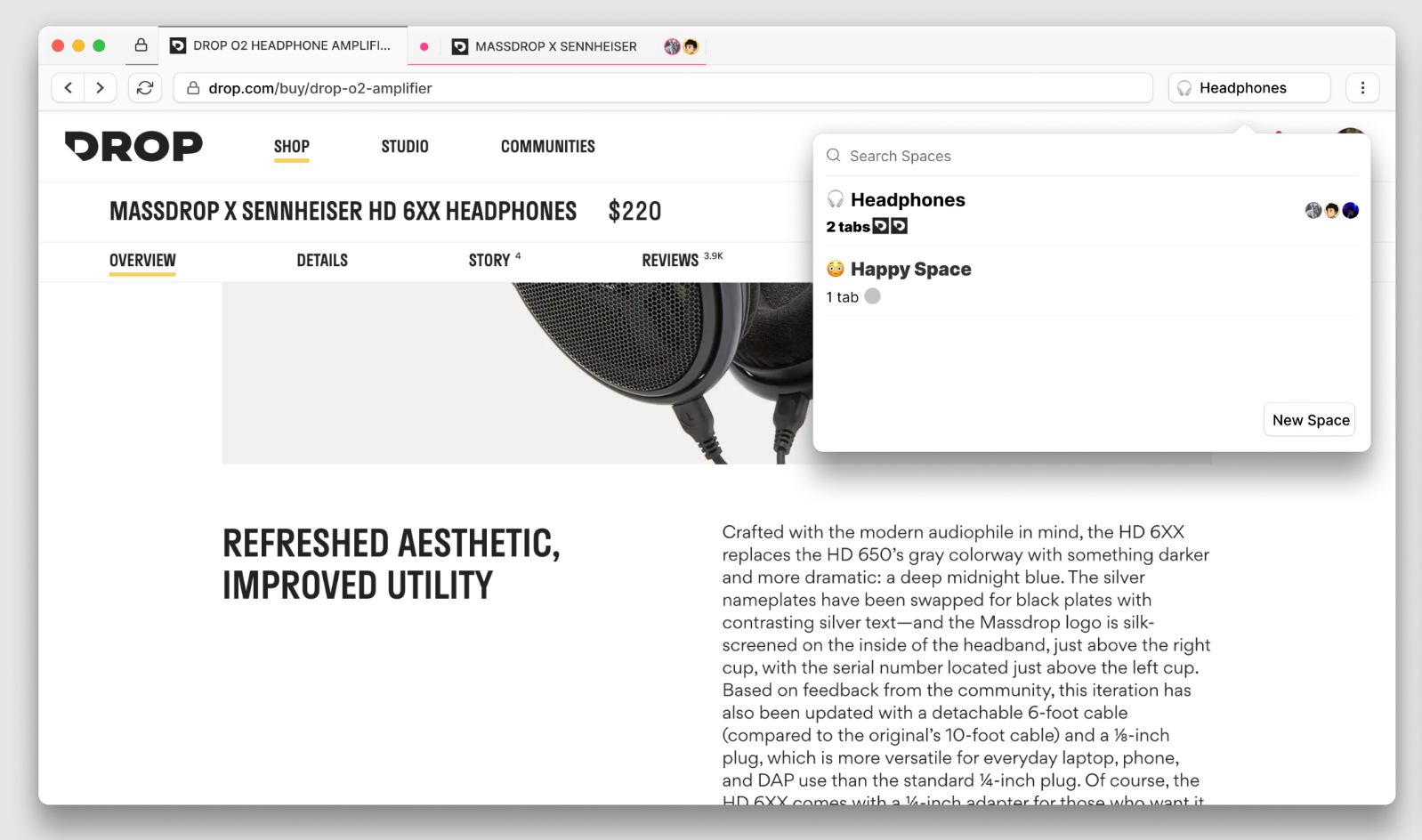
Sail started off as a toy chrome extension inside of generic Chrome. It replayed basic DOM events between multiple users, only the host who has the extension themselves. The others joined by inputting an URL inside of their chromium based browser. What’s the bigger idea here?
Summary
We figured that an “Internet Native Computer Interface” that was used by multiple people at the same time would still have the same basic components that a more traditional computer would have. Some active working area where users could belong, which we called a . A navigation and retrieval system like spotlight, generically dubbed . Groups where resources not actively used would be stored and shared, might look something like Are.na or Pinterest.
What Worked
People were extremely excited by the idea of using any website in real time. The simple demo of clicking around on a government website, highlighting together on a blog was a super compelling and new concept. There was a wide range of applications or use cases that people came up with.
What Didn’t
- There were far too many concepts introduced for anyone to understand or perceive this as one single product
- The positioning of a browser was troubling. It’s an insane ask to let people rework their understanding of browsing people a personal flow into something they should actively share with others in real time.
Takeaways
- A Chrome Extension is much simpler to distribute, but extremely flaky in terms of users remembering how to use it. It’s feature limited to a degree that the idea of “Sharing” the site seems more cumbersome than a more limited screen share.
- “This feels like it should belong natively to my Operating System or my Browser”
- It’s hard to find people at the right time to use the extension, so it’s a companion to my existing flow to a call (Phone, Zoom, FT, etc)
- Most of the usage went back to occasional screen share replacement or watching videos together during covid.
Sail, the Browser (v0.1 - v0.3)
Summary
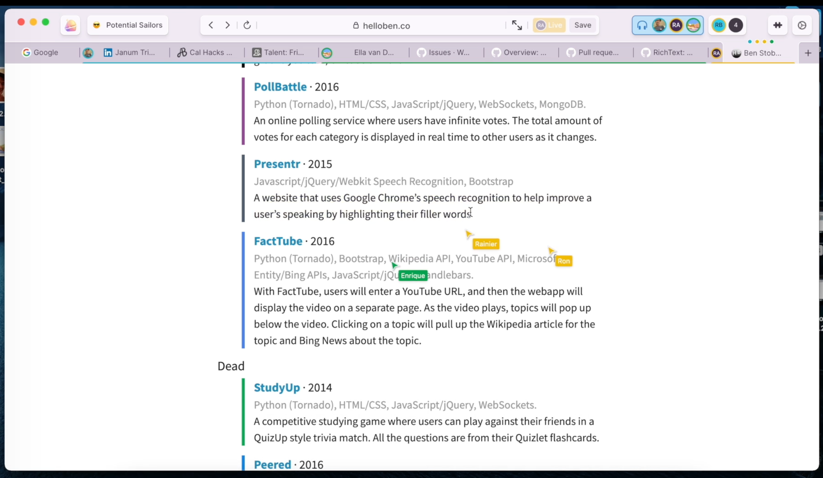
Pretty self explanatory. Sail is a multiplayer browser, where each window represented a different workspace. Each workspace had private tabs that were only usable by you, and a shared group of tabs that were being sync’d in real time, so they could be used multiplayer.
Sail Prototype v0.2Sail put together a prototype of an experimental web browser that behaves like Google Docs in order to solicit user feedback on what they wanted out of a collaborative…https://vimeo.com/585224250/e4073b8a5eWhat Worked
On first look, it was fairly simple. At least in comparison to some of these later ideas. It looked like your existing browser, and it worked like your existing browser. The idea that tab groups/windows as working spaces resonated (Apple and MS would later implement the same idea)
What Didn’t
While MS and Apple would do faces on tabs later on, the concept of “live websites” inside of tab groups was both compelling and confusing. Hosting is a technical concept, so the idea that I had to “host” a site for you to look at in a tab group of my own made navigation troublesome.
Takeaways
- The idea of looking like a browser also brought on the negative connotations that are strung along with existing browsers. This includes:
- Managing Tabs
- Managing Windows
- I have to keep everything open, so RAM hog
- People we’re most excited about the potential of more async use cases over anything that was super Live related. How can I leave a message. Can I write a note? Can I annotate?
- Users confirmed the concept of having similar if not exactly the same tabs open across other teammates.
- Outside of work, or the occasional personal workflow like travel, most people just wanted to watch tikok or youtube with each other over live. Seemed like a lot of complexity to simply do that.
Sail, the Workspace (v0.4)
Summary
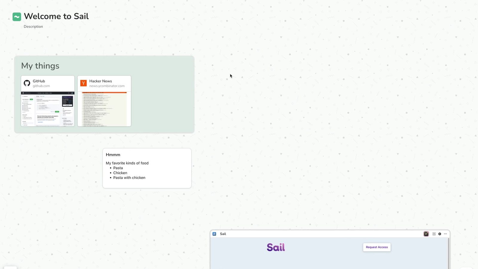
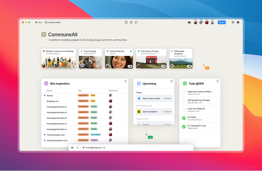
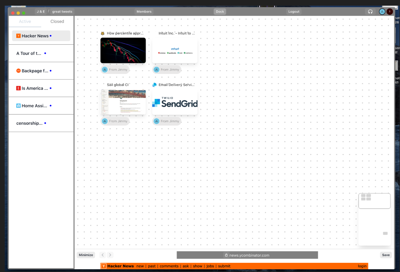
Not too much of this went into explicit production, but a lot of the mechanics were prototyped or played out on top of the chromium infrastructure. We realized that collecting tabs wasn’t it, but we weren’t sure that simply structuring web views made a lot of sense either.
We knew that working with websites have a lot of value because of the metadata context (Linkedins for recruting, Jira Tasks, etc) that we could pull by being the browser. We also knew that we’d have to implement the rest of the table stakes standards that the more traditional collaborative workflow apps (Notion, Figma, Airtable) have like comments, ACL, etc.
The framing we were most excited about was letting users create Flows that prescribed specific repetitive tasks that surrounded the core of working with other people. Think tasks like “Recruiting”, “Product X”, which would fall into the scope of people building their own replacements to an ATS or Task Manager.
What Worked
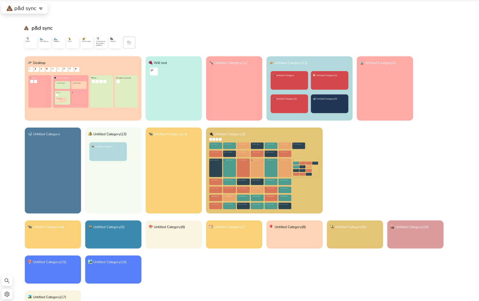
The hypothesis that users wanted to work with material and abstractions beyond the web card was clearly correct. Having some basic elements like a note card, as well as the basic collaboration elements like comments/chat in the same place as the “tab management” stuck.
What Didn’t
Almost all of this didn’t work to be blunt. The most poignant parts:
- Worst of all worlds.
- All the complexity should just be handled by specific applications
- Too many concepts had to be introduced for this application to be remotely useful. So hard to learn/adopt.
- Completely broke WYSISYG
Takeaways
- All forms of talking (chat, comments, notes, audio, video, etc) alongside my apps makes a ton of sense. Need to simplify the bar to get there
- It was clear that “personal browsing” to share something and using shared resources needed different and unique implementations. These are two different states.
- Having any concept of tabs and a stored space of cards felt hard to work with.
- Trying to force structure with the way websites work is tough. They require minimum widths of 900px to reliably render as the developer intended.
Project Coordination Experiment (v0.5)
Summary
We started by eliminating any real aspiration of “real structure for workflows”. What we were left with is a canvas that supported web cards, and a browser that would make it easy for users to find resources from the web and add them inside of these “Spaces”.
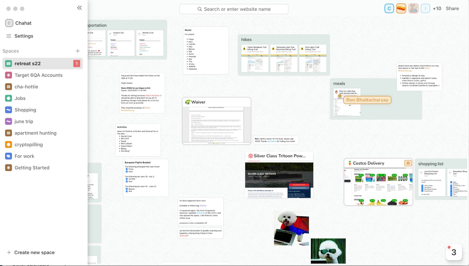
Each of the spaces was positioned as a different project. Similar to the structure that you would give a Slack Channel inside of a Slack organization. Each of these spaces was a committed place for resources related to each of these topics or projects to live. There was no explicit messaging, but there was comprehensive support for a variety of resources, as well as “live” to enable screen share use cases with a more generic chat companion application.
What Worked
Being able to lay out resources in a simple, reliable format, while being able to use those resources alongside each other resonated. People really understood the concept when there would be organic collisions. While they were working on something, others would come into the space, the would start using resources together, and feeling like their work mattered and the same point in space and time was cathartic.
What Didn’t
A lot 🤷. It’s worth noting that this time period, we likely moved too many variables at the same time. There were periods of time where websites would open inside of the canvas, but there was no browse. There was a period of time where websites popped out, other cards didn’t, and the megabar browser existed. At some period the sections were structured. At some point they weren’t, and called groups. We didn’t consistently put each change and iteration out in the market. It’s possible that we left a “great” combinatoric in here somewhere.
Takeaways
- User Presence can get complicated while trying to work through whether a website is being hosted or not. Neither implementation of toggling each card on to live manually or streaming every card naively by the person who first opened them made sense
- While popping out web views instead of making them render inside of the canvas was both technically simpler and cleaner, it made it hard to fulfill most use cases that were sync multiplayer. These required that the cards be laid out next to each other.
- It was really hard for users to understand why and how there were different representation of cards whether they were in a group or not. Text cards are usable on the canvas, but then sites aren’t? What should I expect?
Sail, the Canvas Chat (v0.6)
Summary
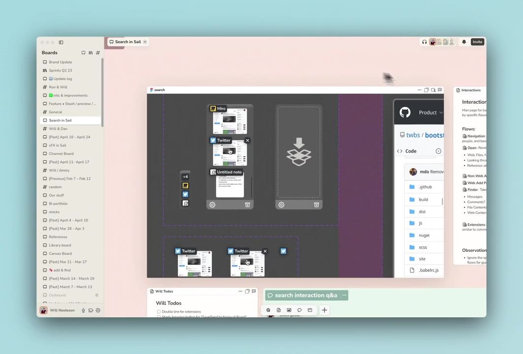
We introduced three types of spaces:
- A Canvas: Meetings, Brainstorming, Research
- A Grid: Storage, Team Hub, Resource Manager
- A Channel: #general, DMs, Group Chats
The key change from other apps would be that there are smaller artifacts called groups. Groups were miniature versions of each of these spaces. So a user could build a canvas with some chats and some grid structures, or make little presentations or meeting spaces inside of a channel.
More importantly, you could make a group in one place, and use it in another. The material would carry over, and update as you made changes across each of these spaces.
What Worked
There was strong retention, usage, and production of value using the product internally. We completely migrated any document creation and project management outside of notion. Usage of discord diminished to the occasional DM from the bathroom or announcement. We truly adopted Sail as our hub for communication. Started to slowly eat up lots of default browser behavior
Takeaways
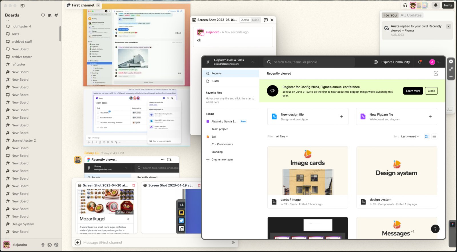
- There’s too many moving parts. It’s pretty complex to get started. Basic tasks like responding to a query, relaying feedback, interacting with an application took too much skill with a mouse and keyboard.
- Hiding comments in a panel that wasn’t persistently on was a mistake. It nerfed a behavior that was fairly successful inside of Sail. Especially because comments were the primary format for communicating ideas between people.
- It’s really hard to organize the sidebar in a way that would help the user adopt this complexity in a way that would be easy to manage upfront.
- Having different types of spaces can easily exasperate the first mile problem. “What the hell am I actually supposed to do with this product?”
- The stash felt like another complex layer that would be hard to discover initially, but then grow into something insanely complex.
Muddy, the Chat-like Browser (v1.0)
Summary
We eliminated all types of spaces, and only left one container (a chat). We then drastically changed the positioning of the product. Instead of treating Muddy like a file system, we asked users to use Muddy as their core internal communication app. This usually means replacing Slack or Teams inside of a company or a sub-team.
The main draws to Muddy were the types of workflows people wanted to do inside of Slack were limited to Slackbots and text. In Muddy, users could send each other complicated workflows by directly sending the exact frame inside of a website, and ask other users to take action and talk in the same workspace. Software as language in a literal sense.
As with the rest of the industry, we added various AI features across the product. Small ones like tab organization and improved search over websites, and large ones like AI agents that could read active tabs and provide action steps for you (ChatGPT but with websites). You can play with this product by downloading off our website.

What Worked
Being positioned as “If ChatGPT was a browser” was incredible for top of line growth without needing much effort. Simply being #1 on HN for most of a day funneled 30k people in, and we had more than enough traffic to learn from. It also gave people something to grasp onto while waiting for other people to enter the product, which was constantly a problem in other products.
What Didn’t
There was near zero translation from “let me try out these AI with websites” users into bringing in teammates. Most of these users were also in mostly interested in the same productivity gains that the AI chatbots promised, and had specific reasons to be interested in our twists. We did 29 interviews over the course of two weeks with these people, and people specifically asked to turn of multiplayer in a third of these interactions.
Conclusions
Building products and businesses aren’t an empirical exercise as much as we tried to make it one. That being said, we kept running into the same fundamental issue with no recourse: people were vehemently opposed to our multiplayer features. Both our vision and our business relied heavily on a teams product that could be adopted bottoms up.
This also lined up with most of the use cases people were most excited about with Muddy. While they might involve some additional involvement from others, the core of the flow would be taken care of by one individual. You can see some of the most useful cases here.
It’s possible we failed to position the product correctly or find the right interface choices that encouraged sharing. It’s more likely that the market we committed to (high growth startups) likely just didn’t have the use cases that were ideal for collaboration. More over, the larger an organization got, the less likely it’s individuals were invested in good sharing, as silos are comfortable.
We may have also missed our gap inside of the Overton window for remote work and collaborative tools. Speaking to other founders building remote tools in 2020-2022, there was a huge spike in traction, but the same value propositions of “virtual office” became negative as remote work became less desirable by businesses over time. We were in the unique position of being able to provide those same services without the positioning, and maybe our form factor could have stuck as we waned out of COVID-19.
I also do think that as we’re entering the current AI wave for tools (Cursor, Intercom, Salesforce, etc) across different functions, the actual work that users do will be much more silo’d. This might be a good thing for net productivity as it lets employees just “focus on the thing”, but will become a new management challenge moving forward.
As I said, none of this is empirical, but my best judgement of our situation. Take the conclusions with a grain of salt. If you’re thinking about this space or would just like to learn more, please reach out to me over email or X.
Originally published on Notion.